
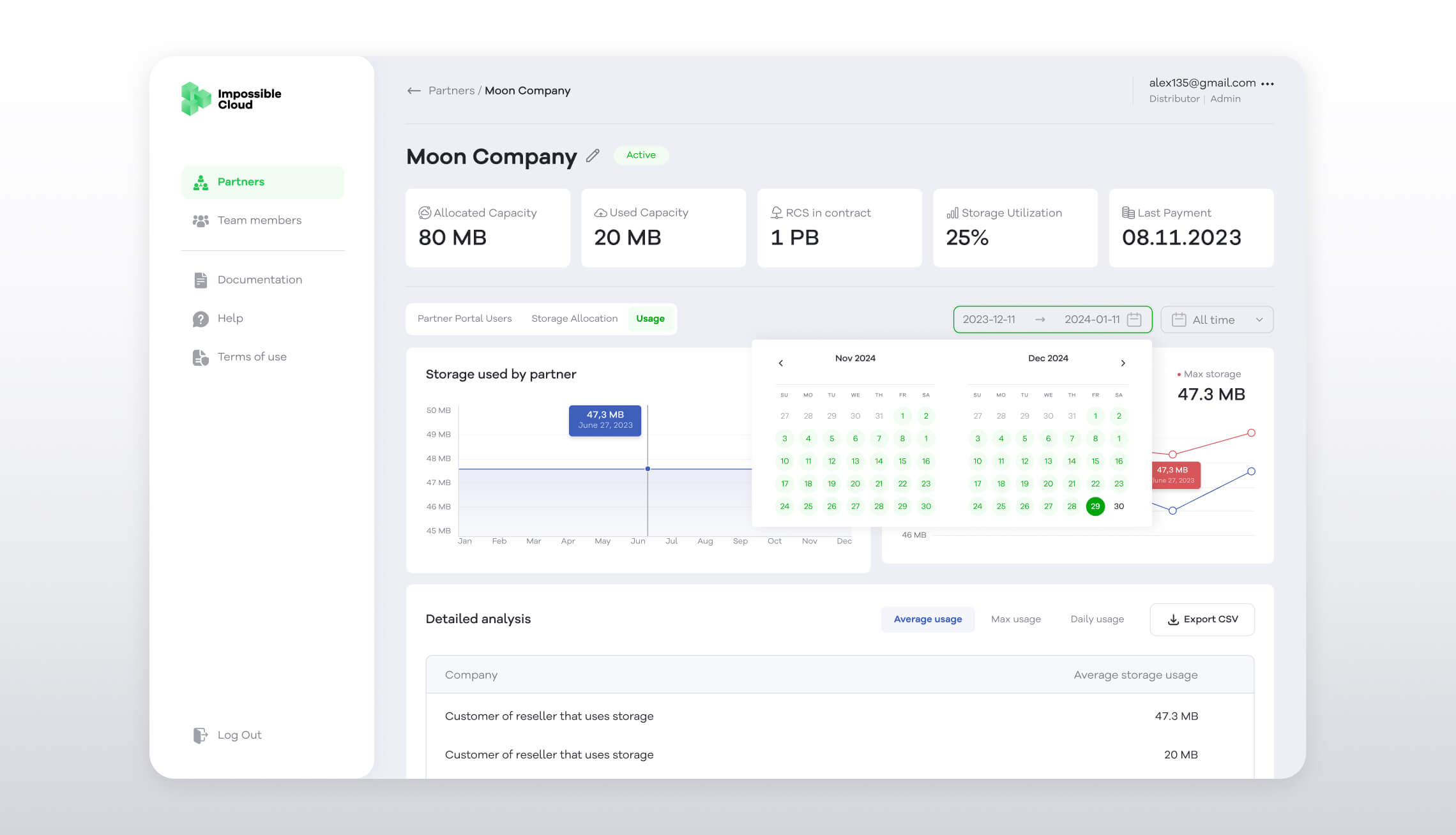
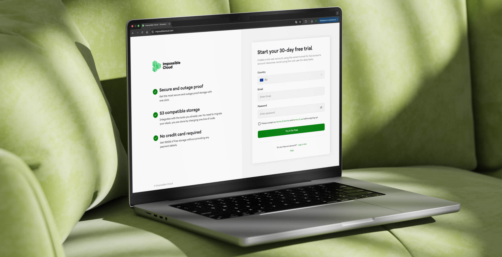
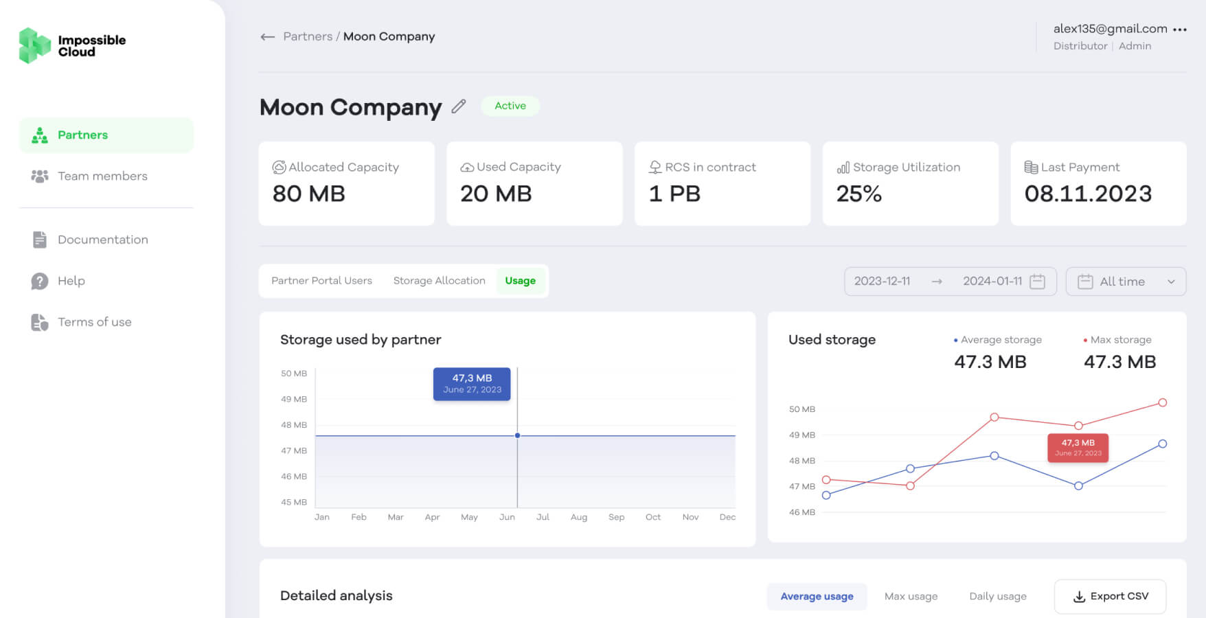
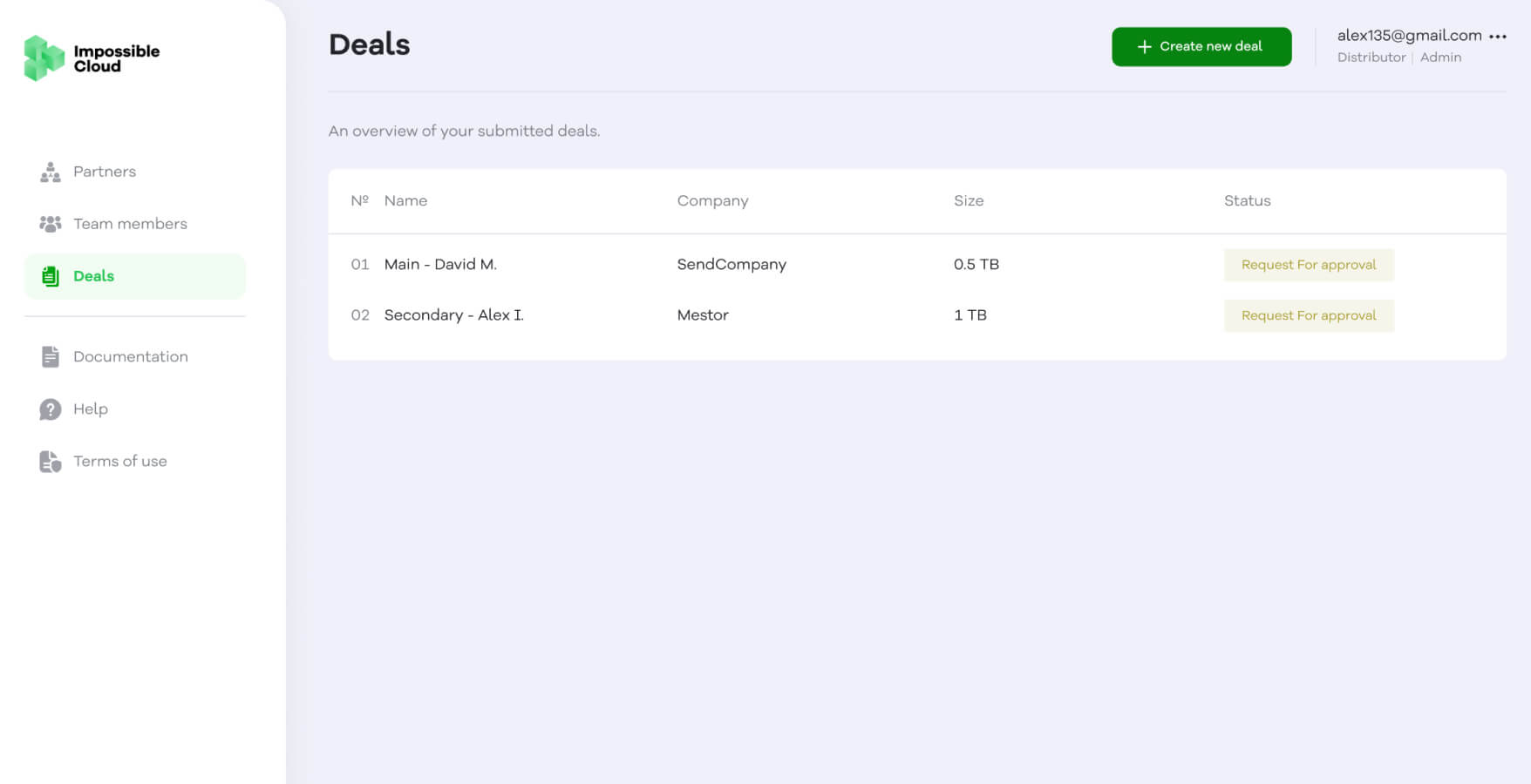
Impossible Cloud offers a technically complex product - from S3-compatible storage to GPU infrastructure, but the dashboard had to make this feel clear and approachable for business users. The difficulty was in bringing forward key aspects like data sovereignty, performance, and pricing without letting the technical depth take over the experience.
UI/UX Design (Dashboard) for the cloud storage company
industry
No items found.
LOCATION
Germany
Project needs and challenges
Solution we offered
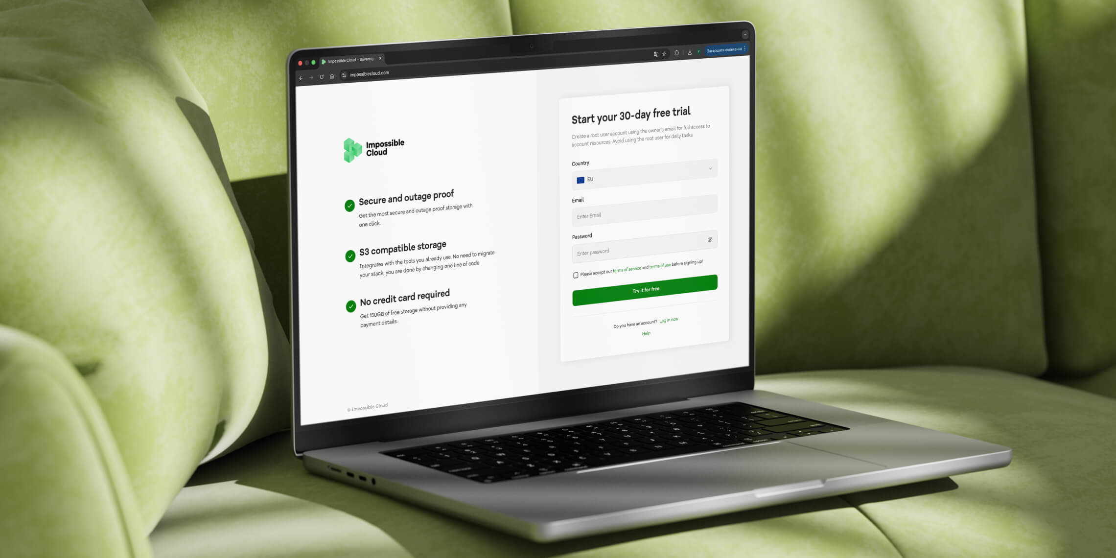
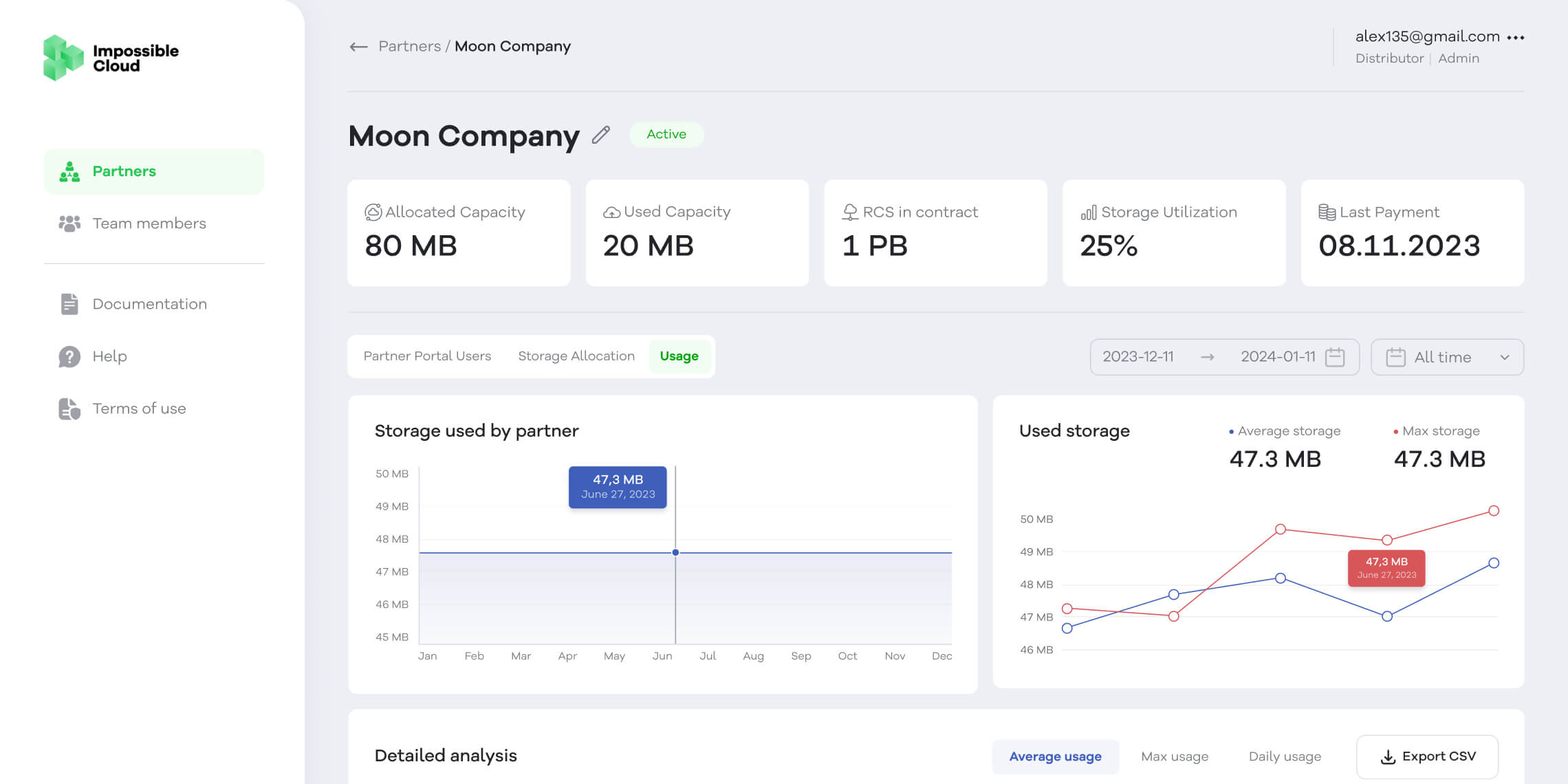
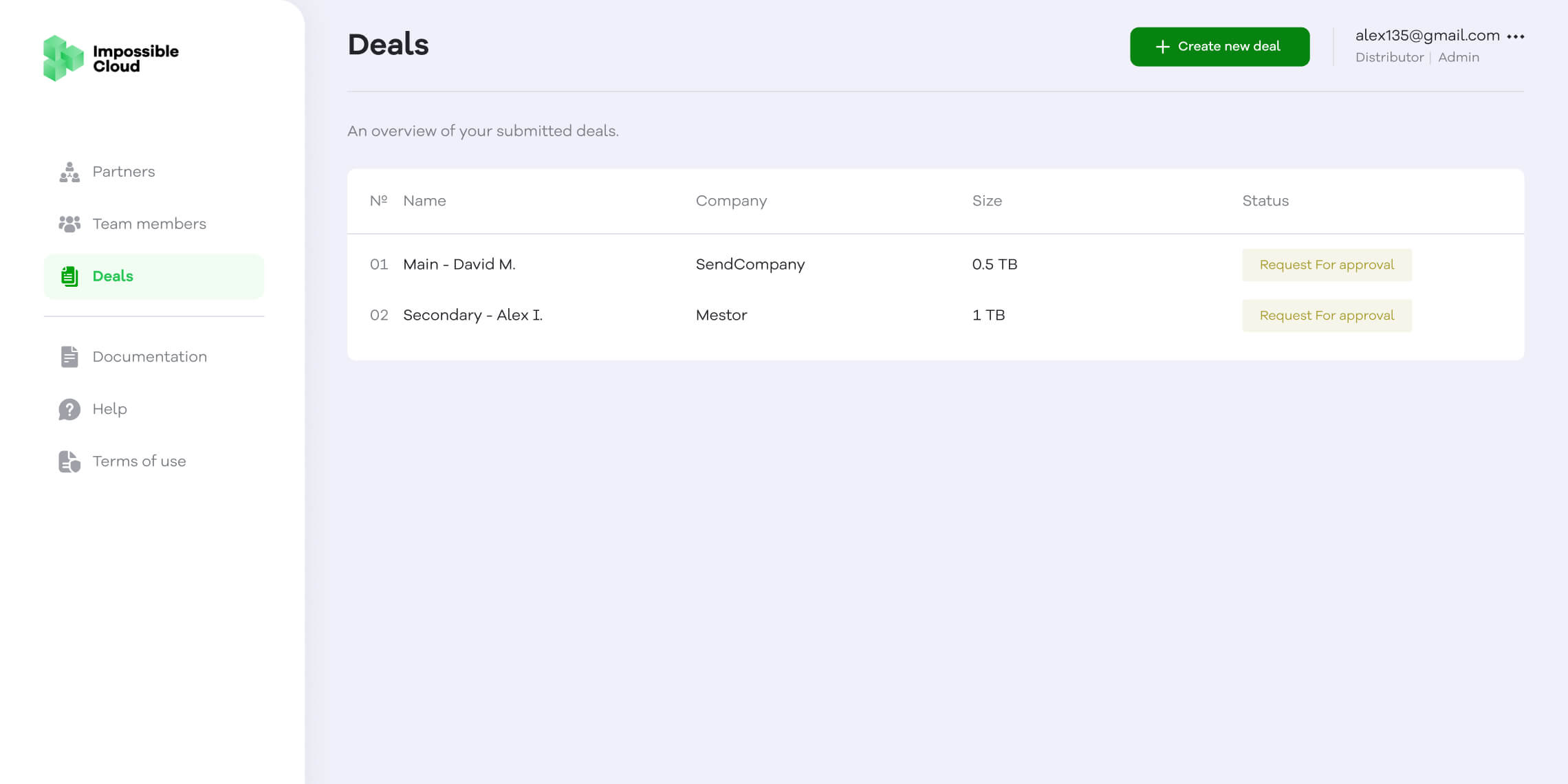
We centered the structure around security and innovation, so the key ideas come through immediately without forcing users to dig for them. Focused messaging and well-placed calls to action help maintain clarity even as the content dives deeper.
No items found.
No items found.
Implementation details
The dashboard uses modular content blocks to break down complex information into digestible sections, supported by trust signals such as certifications, customer testimonials, and company scale indicators. Product offerings, including object storage and GPU servers, are presented with clear entry points and supporting information, so attention stays on the product itself, not on figuring out the interface.
Tools we used

Figma
No items found.
Init
.png)
.png)
.png)


